SwitchOn · DeepInspect
DeepInspect Train
The application factory teams use to set up inspection for new SKUs and train AI models — without an in-house data science team.
- Role
- Product Designer — sole designer
- Scope
- User research, interaction, visual design, prototyping & testing
- Timeline
- November 2022 — ongoing
Overview
- SwitchOn built this application so end users could set up inspection for entirely new SKUs themselves.
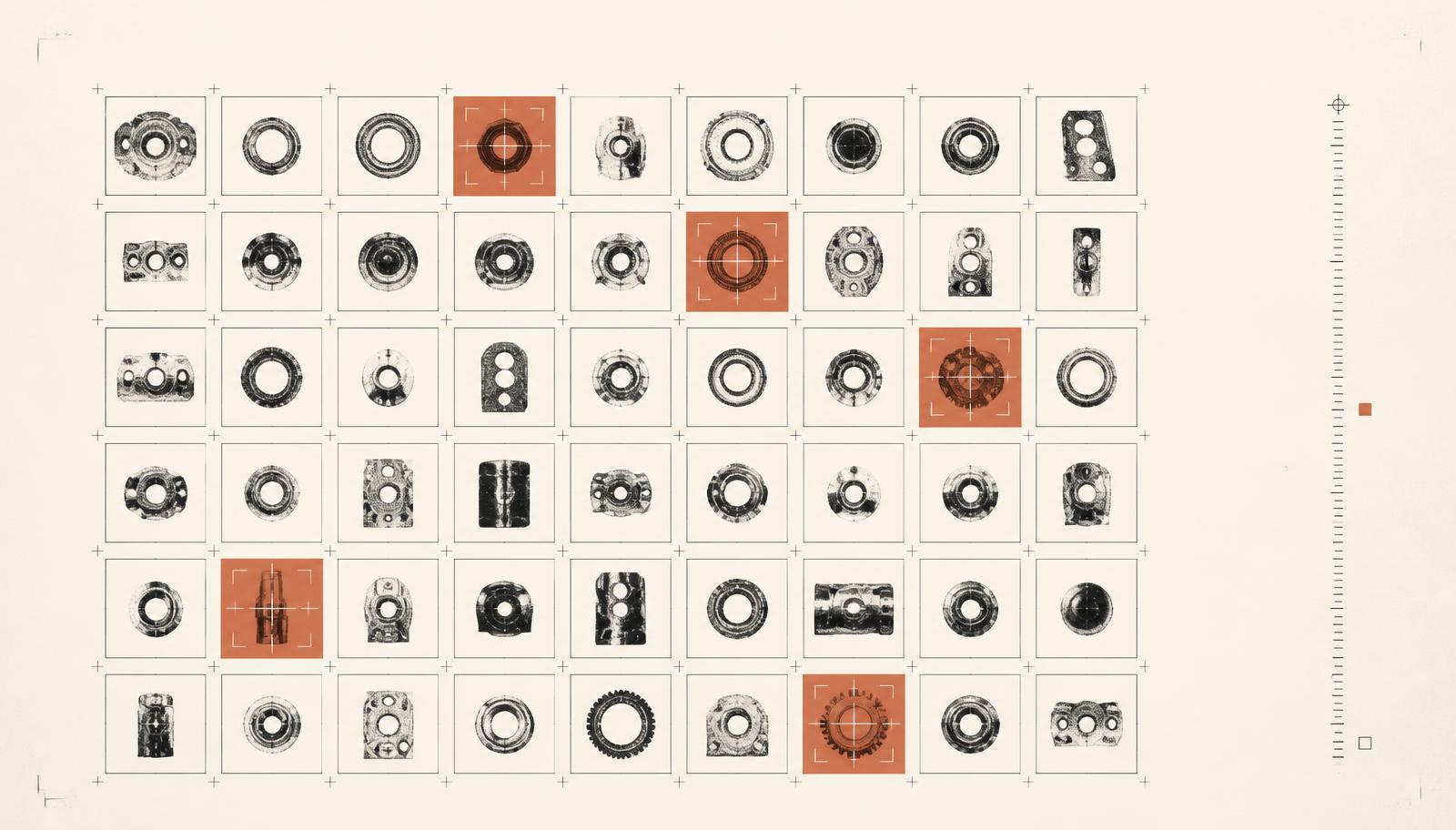
- It uses the latest tooling in optical character verification and surface inspection.
- Users train AI models without needing an internal data science team.
Make the application user-friendly enough that end users can train their own products independently, with no expert assistance.
Background
SwitchOn is a Bengaluru-based industrial AI start-up that transforms quality and reliability in manufacturing plants using advanced machine vision and edge-AI technology.
Along the way I implemented a design process that gave the team structure and visibility across sprints, improved usability across a platform that had never been usability tested, and established a design system so Engineering and Product understood how and why we pick certain components.
The process
Our process is based on the Double Diamond and Lean UX — Discovery, Definition, Ideation and Implementation. Interviews, user research and competitor analysis feed into assumptions and hypotheses, then problem statements, user stories, lo-fi wireframes, prototypes and hi-fi design with development.
The problem
Before SwitchOn hired a design team, a beta of this platform had been built from blue-sky concepts by an external consultancy — no usability testing, and little consideration for technical or product constraints. I ran research interviews with our primary users to uncover the pain points they hit with that beta.
- Understanding user goals and needs
- Uncovering pain points in the existing journey
- Determining how successfully tasks were being completed
What we found
- 57% of users felt training a model was arduous
- 29% were frustrated that navigation increased their cognitive load
- 29% found it easy to miss field inputs because of weak visual hierarchy
The solution
- Reduced the number of steps to minimise time to completion
- Surfaced mandatory fields and wired the Next button to show error validation
- Established a clearer form hierarchy by grouping related fields
- Created a standardised wizard styling and UI pattern, since no formal wizard component existed
Developing it
I built high-fidelity mockups in Figma and worked closely with the front-end team to spec interactions the mockups didn't cover. I reviewed the UI/UX of every front-end ticket before it went live.
Results
Since the new training application shipped, complaints logged through the service desk dropped significantly, and users and sales have given positive feedback on how much simpler their end-to-end configuration became — saving them a large share of their time.
- User testing doesn't end at development. Design is constant iteration — always find ways to collect and listen to feedback.
- Involve engineering upfront. Understanding technical limits early informs design strategy and avoids rework.